
Card Component Change Drives 12% Bulk Edit Adoption

CONTEXT:
Within journeys, clients often need to duplicate or delete multiple email nodes at once. Our platform only supported managing one node at a time, which made bulk actions tedious and frustrating for users managing complex logic.
DISCOVERY & USER INSIGHT:
Early in design discovery, it became clear this wasn't just a matter of adding a new action. Our existing journey step components needed to be reformatted entirely to support two new needs: making cloning easily accessible, and enabling a seamless multi-select experience across the map.
I began exploring several new formats that could scale across each step type in a journey (message steps, wait times, etc).
I considered entry points via a settings cog, both as the nodes were at the time, and exploring a contained section. Once I mocked up the variants we'd need for error states, there was too much visual clutter.

We needed to display:
PRODUCT EXECUTION:
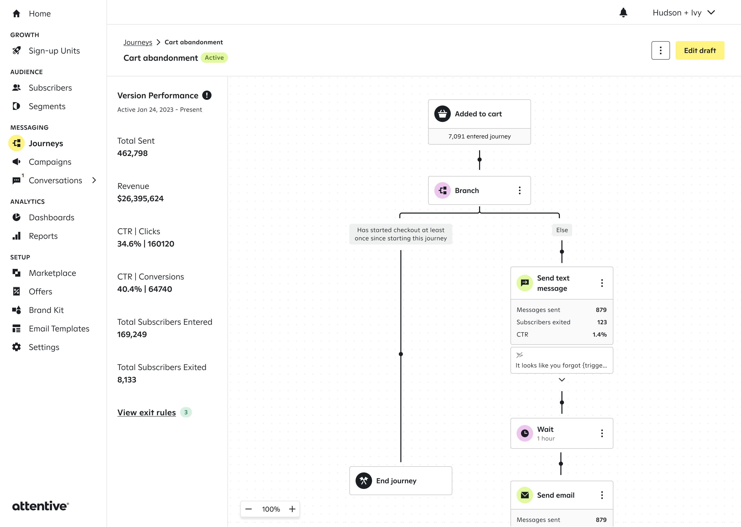
After iterating with my team, we landed on a new version of our design system component that wrapped each journey step in a card. This introduced uniform, fixed-width cards across the map, making even complex journeys much easier to scan at a glance.
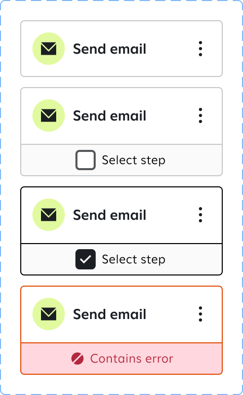


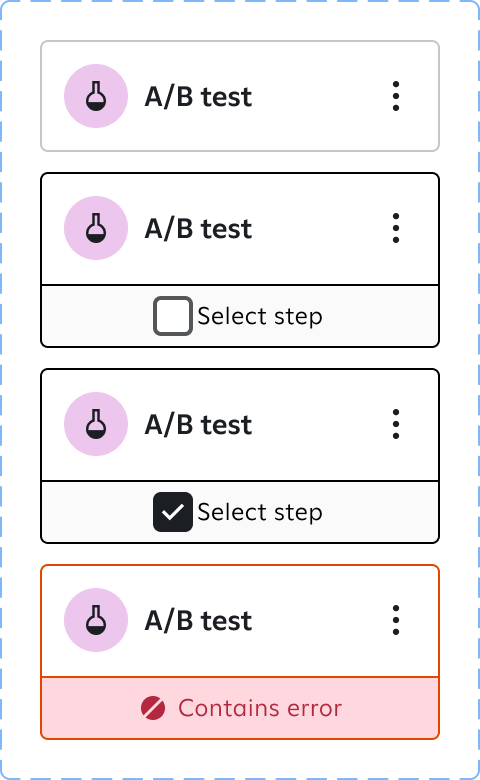

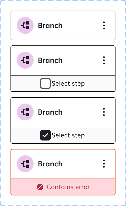
Journeys are sent to millions of subscribers, so I wanted users to feel confident when making bulk edits using the new multi-select function. We added a floating toolbar to the top of the journey map to give users that confirmation and guide them toward their next action. This also addressed UX feedback that clients weren't sure how to paste copied steps once they'd copied them.
The toolbar reflects the exact action taken and number of steps involved, giving users a clear confirmation for every edit, single or bulk.

While each component solved a specific interaction challenge, the real measure of success was how they performed together in complex, real-world journeys. The redesigned journey cards created a cleaner, more scannable map, with consistent card widths that reduced visual noise and made it easier for marketers to understand journey structure at a glance.
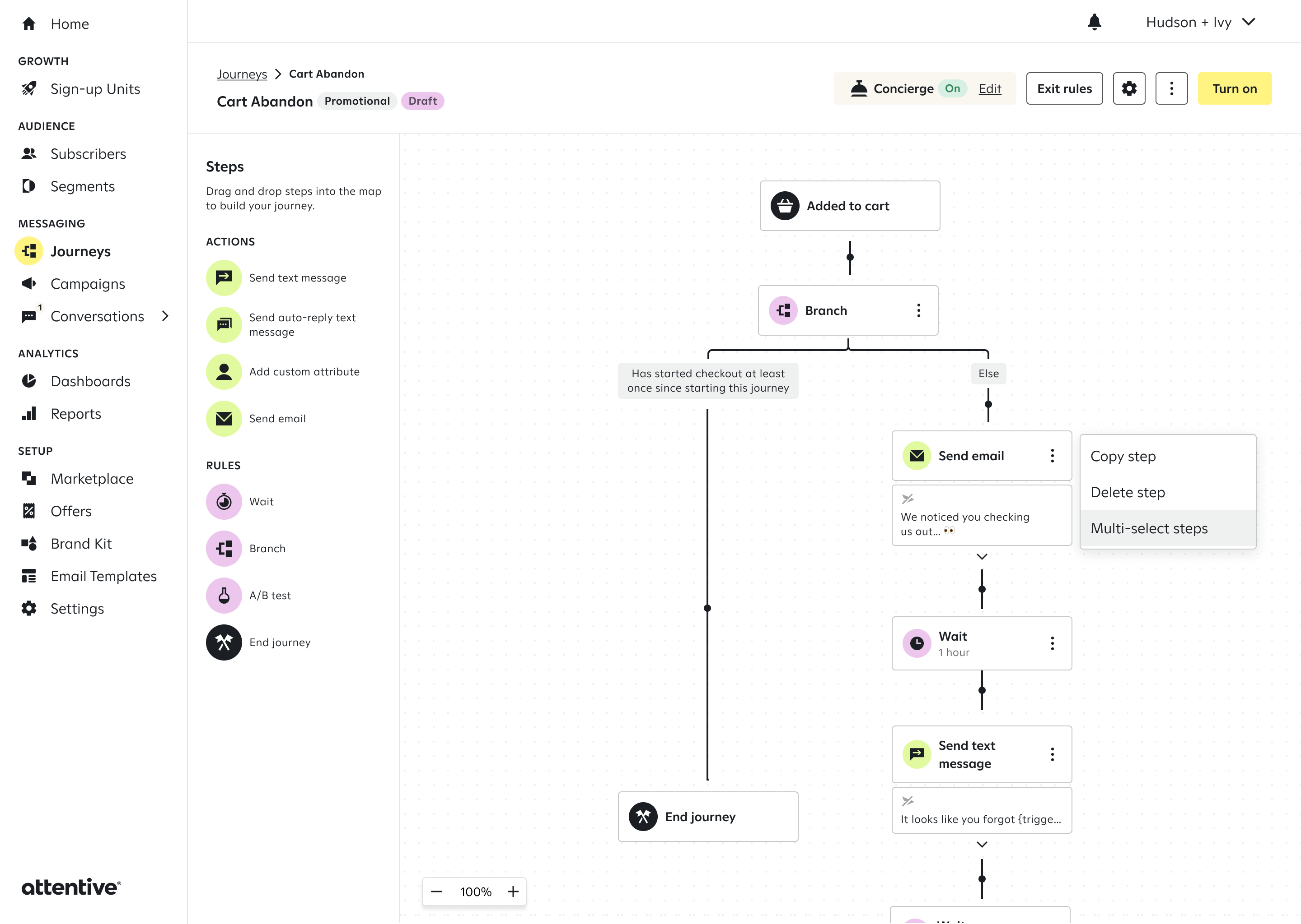

The new card design also transformed how reporting was surfaced within active journeys. A clearer information hierarchy made existing metrics easier to digest, while providing a flexible foundation for future insights. More space for metrics enables marketers to diagnose issues and evaluate performance directly at each step.
IMPACT
"Personally, the feature I love the most is the multi-select copy feature in journeys. It's cut down on journey creation time tenfold." - Enterprise marketer
Since launch in May 2026, users have performed 4,025 bulk actions across copying, pasting, and deleting journey steps, replacing what was previously a repetitive, node-by-node workflow. Bulk deletion saw the strongest adoption, with nearly 12% of all delete actions now using multi-select. Because each bulk action represents multiple nodes managed in a single motion, the actual reduction in manual clicks and journey-build time is significantly greater than the event count alone reflects.